How to Choose a Countertop Color for a Small Kitchen
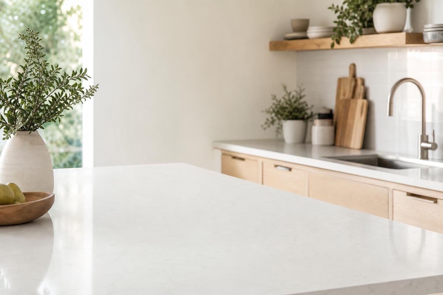
Key takeaway
For a small kitchen, choose a countertop color close in value to your cabinets and walls (light-on-light or mid-tone-on-mid-tone), pick a slab with small, quiet veining rather than bold movement, and test the actual sample under your kitchen's real light at different times of day. Contrast is what makes a room feel chopped up and busy; continuity is what makes it feel bigger than it is.
Key takeaways
- Match countertop value (lightness/darkness) to your cabinets within one or two shades to avoid visually cutting the room in half.
- Pick a slab with tight, low-contrast veining — busy movement reads as clutter on a small run of counter.
- Bring a physical sample home and check it in morning, midday, and evening light before deciding; screens and showroom lighting both lie.
Why value matters more than hue
Most people shop for countertop color the way they shop for paint — picking a hue they like. But in a small kititchen, value (how light or dark a color is) does more visual work than the actual color family. A pale quartz next to pale cabinets and a light wall creates one continuous plane the eye reads as open space. The same pale quartz against dark cabinets creates a hard edge that chops the room into stacked blocks, which makes a tight galley or condo kitchen feel smaller, not bigger.
This is why designers often recommend keeping counters within a shade or two of the cabinet color in compact rooms, then using a single accent — a runner, a pendant light, a few dishes — for contrast instead of the counter itself. If you're also picking cabinet doors at the same time, it's worth reviewing cabinet styles before locking in a countertop, since the two decisions move together.
Pick pattern scale before you pick color
Veining and speckle scale matters as much as the base color. A slab with large, high-contrast veining can look stunning in a photo of a 40-square-foot kitchen island, and busy on a 6-foot run in a 60-square-foot condo galley. The pattern doesn't shrink to match your counter — it's cut from the same slab regardless of room size, so a bold pattern that reads as one dramatic sweep across a big island reads as visual noise chopped across three small runs.
For small kitchens, look for:
- Solid or near-solid colors (white, warm greige, soft taupe) with minimal veining
- Fine, tight speckle patterns rather than dramatic swoops
- Veining that runs in one consistent direction if the slab does have movement, so seams and grain feel intentional rather than random
If you're comparing quartz lines, common quartz brands sold on Oahu each have different pattern collections — some lean toward bold marble-look slabs, others toward quiet, uniform colors — so it helps to know which collection you're choosing from before you fall in love with a photo.
Test the sample in your own light, not the showroom's
Hawaii's light is different room to room and even hour to hour — a north-facing condo kitchen on the windward side gets flatter, cooler light most of the day, while a west-facing Kapolei kitchen gets warm, intense afternoon sun. Countertop color shifts under both. The U.S. Department of Energy notes that LED bulbs are labeled with a color temperature rating (measured in Kelvin), and swapping a warm 2700K bulb for a cool 4000K one over your counter can visibly shift how a white or gray quartz reads — sometimes making the same slab look cream in one kitchen and blue-gray in another.
That's the practical reason to take an actual physical sample home instead of trusting a screen or a showroom spotlight. Set it on your existing counter or a cabinet door, and look at it in the morning, at midday, and again at night under your kitchen lights. A color that looks perfect under showroom halogens can look completely different under your kitchen's fluorescent strip or LED can lights.
Undertones: warm, cool, and neutral
Every "white" or "gray" countertop has an undertone — a faint warm (yellow/beige) or cool (blue/gray) cast that only shows up next to other colors. Getting the undertone wrong is the single most common reason a countertop that looked great as a sample looks off once it's installed next to existing cabinets, floors, or backsplash tile.
A simple way to check: hold the sample directly against your cabinet door and your flooring sample (or a photo of both) in daylight. If the countertop pulls noticeably warmer or cooler than the cabinet, it will fight the cabinet visually even if both are technically "white." Matching undertones — not just matching lightness — is what makes a small kitchen's surfaces feel like one continuous material instead of mismatched pieces. If your flooring choice is still open, it's worth deciding what flooring works best in an Oahu kitchen at the same time, since floor, cabinet, and counter undertones all need to agree.
Sheen and edge profile change the perceived color too
A polished finish reflects more light and can make a pale color look brighter and airier — useful in a windowless condo kitchen. A honed or matte finish absorbs more light and can make the same color read slightly darker and more muted, which sometimes suits a kitchen that already gets strong natural light and doesn't need extra brightness bounced around.
Edge profile has a smaller but real effect too: a thick, heavily beveled edge on a light countertop can create a visible shadow line that reads as a thin dark border around the whole counter, subtly working against the open feel you're going for. A simple eased or bullnose edge keeps the color reading as one continuous surface.
A short decision order that avoids most regrets
- Decide cabinet color and finish first — it's the largest fixed surface and the hardest to change later.
- Choose a countertop within one or two shades of value, matching warm-to-warm or cool-to-cool undertones.
- Pick pattern scale based on your actual counter run length, not the showroom slab's full size.
- Bring home a real sample and view it in your kitchen's own light across a full day.
- Confirm sheen and edge profile last, since both slightly shift how the color reads once installed.
If you want to see how these calls typically flow into cabinet layout and island sizing, designing a kitchen island that actually works covers how counter choices and layout decisions interact once you're past picking color.
Because slab pricing depends on which quarry lot and finish you choose, and installation depends on your exact counter run and edge details, the only accurate number comes from a free quote measured against your kitchen's real dimensions rather than a general estimate.
Frequently Asked Questions
Q: Should a small kitchen have light or dark countertops?
Light countertops generally make a small kitchen feel more open because they reflect more light and blend with light walls and cabinets, but the bigger rule is matching value to your cabinets — a dark countertop with dark cabinets can look intentional and rich, while a dark countertop against light cabinets creates a hard visual break that shrinks the room.
Q: Does a busy or veined countertop make a small kitchen look smaller?
Yes, in most cases. Large-scale, high-contrast veining is cut from the slab at full size regardless of your counter length, so a dramatic pattern that looks elegant across a big island often reads as cluttered and busy across a short run in a small kitchen.
Q: How do I know if a countertop and cabinet color will clash before installation?
Hold the actual countertop sample directly against your cabinet door (or a clear photo of it) in daylight and check whether one pulls noticeably warmer or cooler than the other — undertone mismatches, not just color mismatches, are the most common cause of surfaces that "don't go together" once installed.
Q: Does lighting really change how a countertop color looks?
Yes. Light bulbs are rated by color temperature in Kelvin, and switching between warm and cool LED bulbs over a counter can visibly shift a white or gray countertop toward cream or blue-gray, which is why a sample should be checked under your own kitchen lighting, not just showroom lighting.
Q: What countertop finish is best for a small, low-light kitchen?
A polished finish reflects more ambient light and tends to brighten a small or windowless kitchen, while a honed or matte finish mutes reflections and can suit a kitchen that already has strong natural light and doesn't need extra brightness bounced around the room.